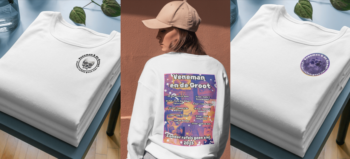
Branding
In this project, together with my fellow group members, I created a branding for Woody&Truus to promote their pub crawl to get more listeners to the brown cafes. They want to bring new life to Dutch folk singing with their new version of Smartlappen called Neo-Smartlappen.
Research
What did I do?
In the beginning I started off with finding out what kind of color scheme was used in bruin cafes. With these colors and letter types I made the first Stylescape together with Lila.
The stylescapes were based of some interviews that I did at the local bruincafes to gather some more information about Smartlappen. see the interviews here.
Why did I do the interview?
I used this information to help my group and me better understand what our stylescape should look like.
Feedback
After getting feedback from Woody, We discovered that this stylescape wasn't what Woody had in mind for his pubcrawl and he wanted a different stylescape. The stylescape that we chose to work with wasn't made by me. To view the stylescapes and other research that I did click here.
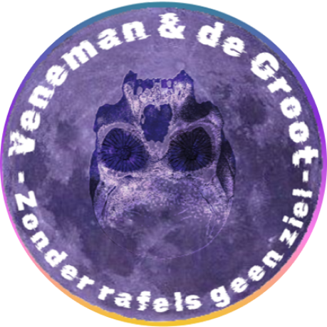
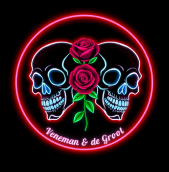
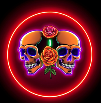
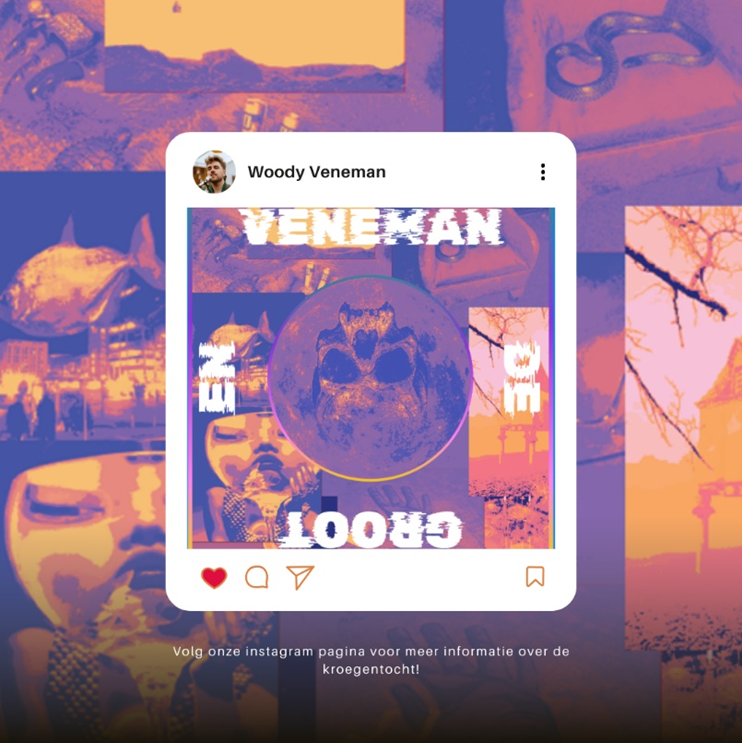
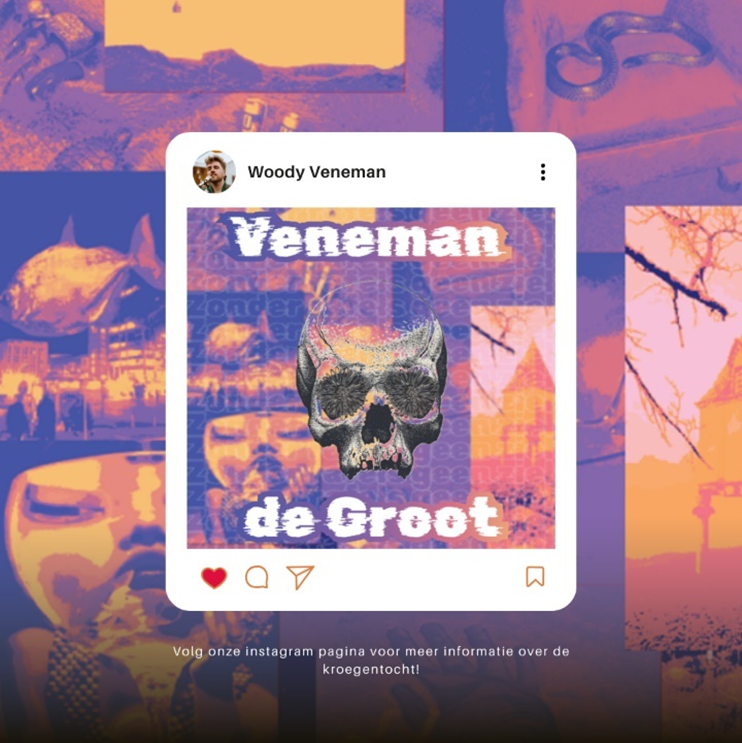
Brand guide
In the Brand Guide I made some logo's. These logo's weren't going to be the final logo's that were going to be used by our group but iterations of them. More information about our teamwork on the brand guide and my work specifically click here.
Content Strategy
I worked on making a goal for the content strategy. The goal would be: To create a fun and engaging pub crawl event that brings people together, promotes Woody&Truus' unique music style, and builds a vibrant community around their neo-smartlappen sound. For more about the content strategy click here.
Final Presentation
In the final presentation I and my groupmates combined everything and presented our work to Woody and Truus themselves. To view the presentation click here.
Why did I do a presentation?
I gave this presentation to showcase the final product my group and I created for Woody and Truus. It was an opportunity to receive valuable feedback for future projects and to identify areas for improvement if we had to do something similar again in the future.
Reflection
I enjoyed working for a real client. I learned a lot about what it's like to work for a client and what to expect. This also gave me new insights into how a brand is built and how to make a brand guide for a client. I also found it challenging to create things without any guidelines on how it should look or what style the client wants, since this wasn't defined yet. This added a new level of difficulty. I didn't find it very comfortable to work this way because I'm not very skilled at design, but I did make progress in researching and learning how to communicate certain things to the client.