Interactive Media Design
For this learning outcome, I created interactive media products that I tested with users and stakeholders. I got multiple different products that are listed below.
A-B Test
Project FixThatUX
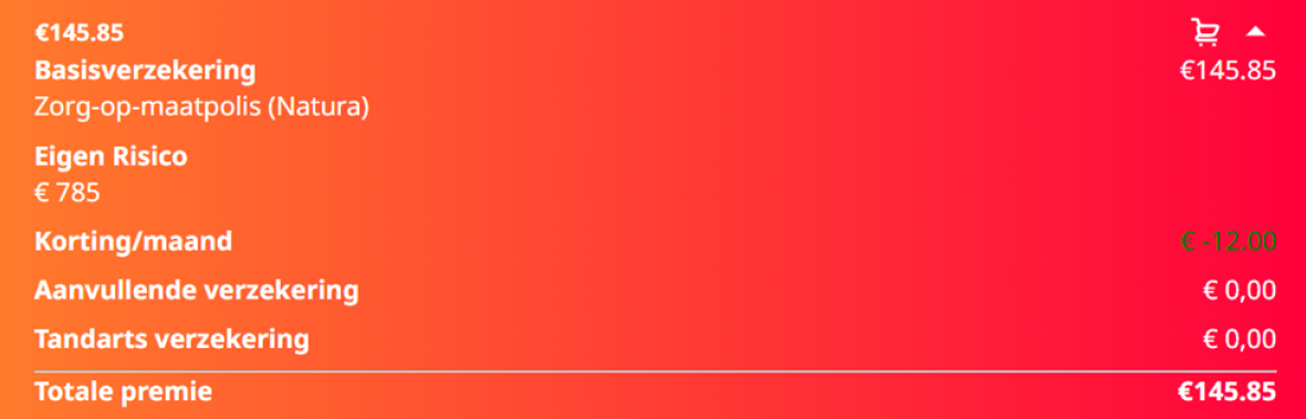
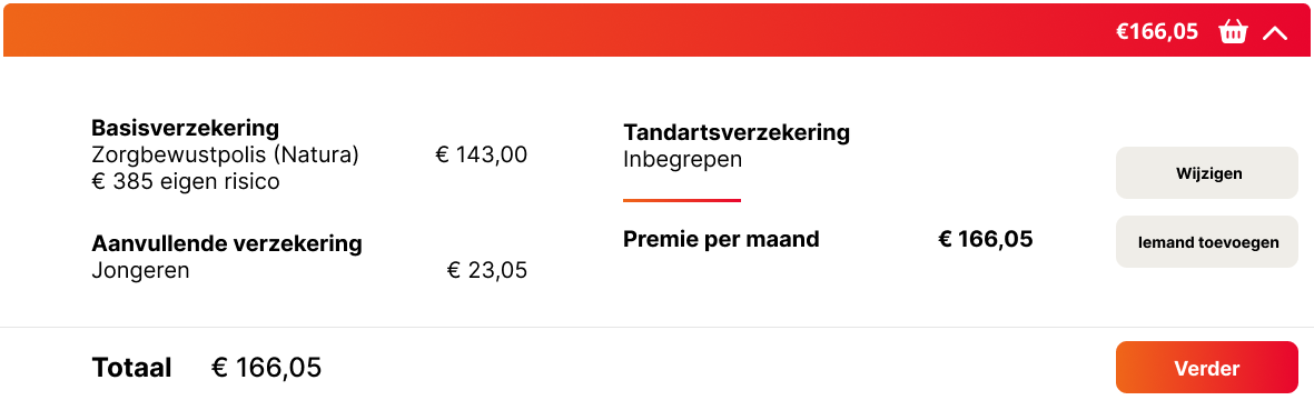
For this first example I did an A-B test about the basket within the premium calculator for the CZ website that I had to redesign and code with the Hike One, Fix That UX project. First slide is A, second one is B.
The link to the full test is here.
Why did I do the usertest?
I carried out the user test to gather feedback and improve the design of my prototype. To make the process more structured, I created a form that users could fill out, which helped me get a clear overview of their preferences and decisions. My primary goal was to understand what users liked most about each design and identify areas for improvement.
Conclusion
The feedback revealed that users preferred Slide A due to its clarity, fast overview, and simplicity.
After the full presentation of the project, it was pointed out that I missed an opportunity to test with professionals. Since I only tested with my friends from my study association, I missed out on gaining feedback from my teachers, which could have provided valuable insights.
Figma Prototype
Project FixThatUX
For this example, I created an interactive prototype using Figma. The prototype is a redesign of the CZ website, which I created as part of the Hike One, Fix That UX project.
Why did I create this prototype?
I created this prototype as an introduction to demonstrate what the real website would look and feel like, providing the client with a beginner-level overview. The goal was to present the project in a way that allowed our client to see and understand what my groupmates and I had created.
More details about this project, along with the full Figma file, can be found in my Hike One, Fix That UX project documentation. You will also find more reasoning how I created the prototype and what I created here.
Code Product
Project FixThatUX
For this example, I developed a fully interactive version of the Figma Prototype as a coded website. To view the full website, go to fixthatux.luuksteijaert.nl
How did I make the website?
I implemented the website using HTML, CSS, and JavaScript. I used the first Figma design that I created together with my groupmates and made a real working product from it.
Why did I put the project live on the internet?
I published the project online both as a learning experience and to make it permanent. Having it accessible on the internet allows everyone to view it and also helps me track my own coding progress more easily.
Interview
Project Branding
For this example, I did an interview with bruincafe locals.
What did I ask?
I wanted to gather more information about the music taste that they have, a colorscheme that they liked within the bruincafes and much more questions.
Why did I need the information that was provided?
I used this information to help my group and me better understand what our stylescape should look like.
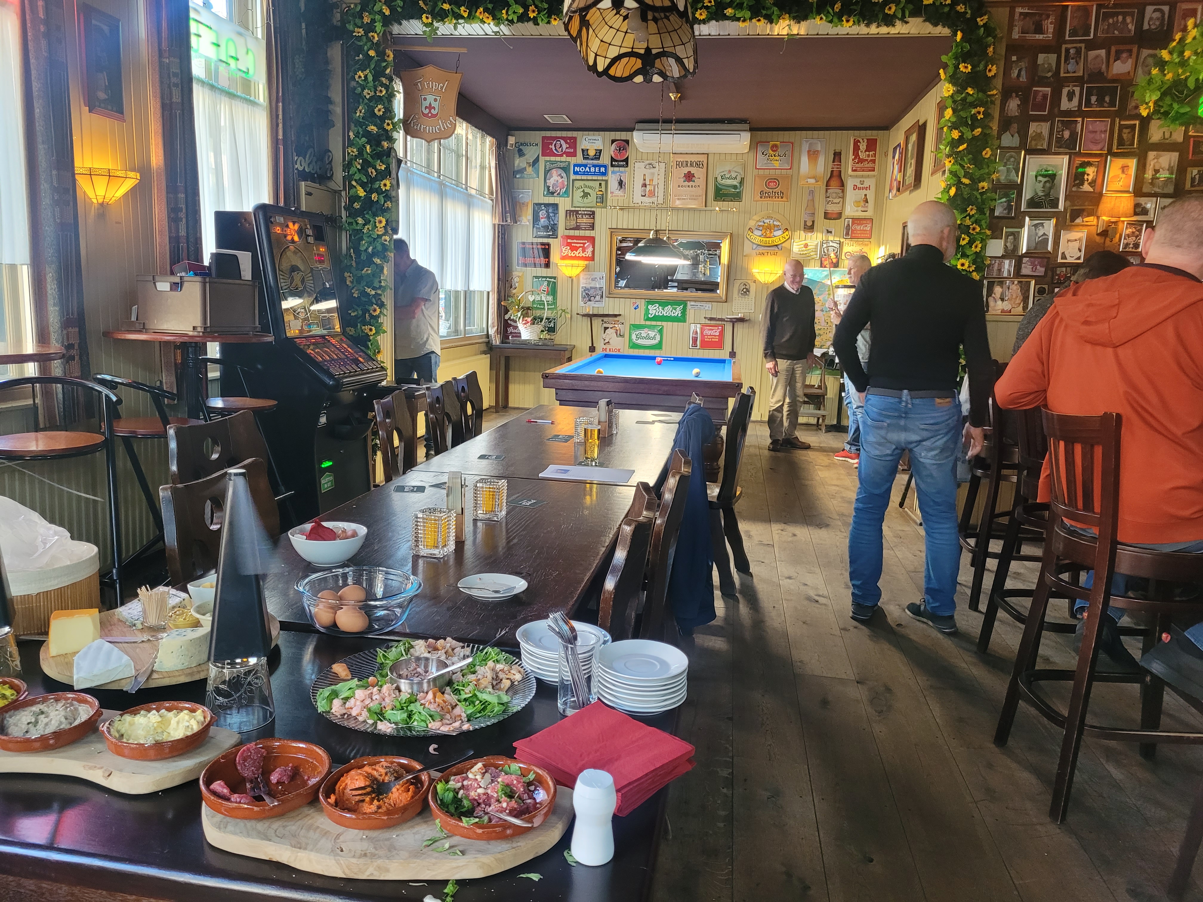
This was the inside of the bruincafe where I did the interview. It already gave me a good idea of what the colorscheme should look like.
To view the whole interview, click here.
Why did I do the interview?
I did the interview because I wanted to know what it looks like within a bruincafe. What music is played, if it's busy or not, and what kind of people go to the bruincafe. This information was important for the making of the stylescape.
Reflection
Reflecting on this process, I found it quite challenging to get
started on creating this page. Looking back, I feel that I could have
created better prototypes, conducted more thorough user research, and
performed a more comprehensive user test on my portfolio. I believe
these aspects were areas where I fell short. Additionally, I wasn't
fully satisfied with the design choices I made for the first part of
my website. I struggled a lot with the design aspect, as I don't
consider myself a strong designer and tend to gravitate more toward
the coding side of projects.
What do I want to do in the Future?
In the future I plan to improve my Figma skills and ask for more feedback on my designs. I also plan to do more user tests and think more about the necessity of conducting user tests.