Portfolio Progress
In this project, I took time to explore my interests and consider how to showcase them in my portfolio. I made several design choices, and I'll explain why I pursued certain directions and decided against others. I'll also reflect on the reasoning behind my choices and how I approached each decision.
Research
To kick off my portfolio, I started by researching a variety of portfolio styles. I already had an idea of what I liked: a minimalistic, dark-mode theme. I chose a minimalistic approach because I wanted the website to look clean and professional. Dark mode was also a priority, as it's popular among developers and many users online.
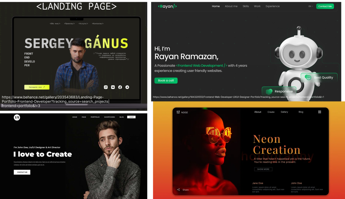
I also wanted to explore using gradients. Gradients have been a big trend this year and are expected to stay popular for years to come.
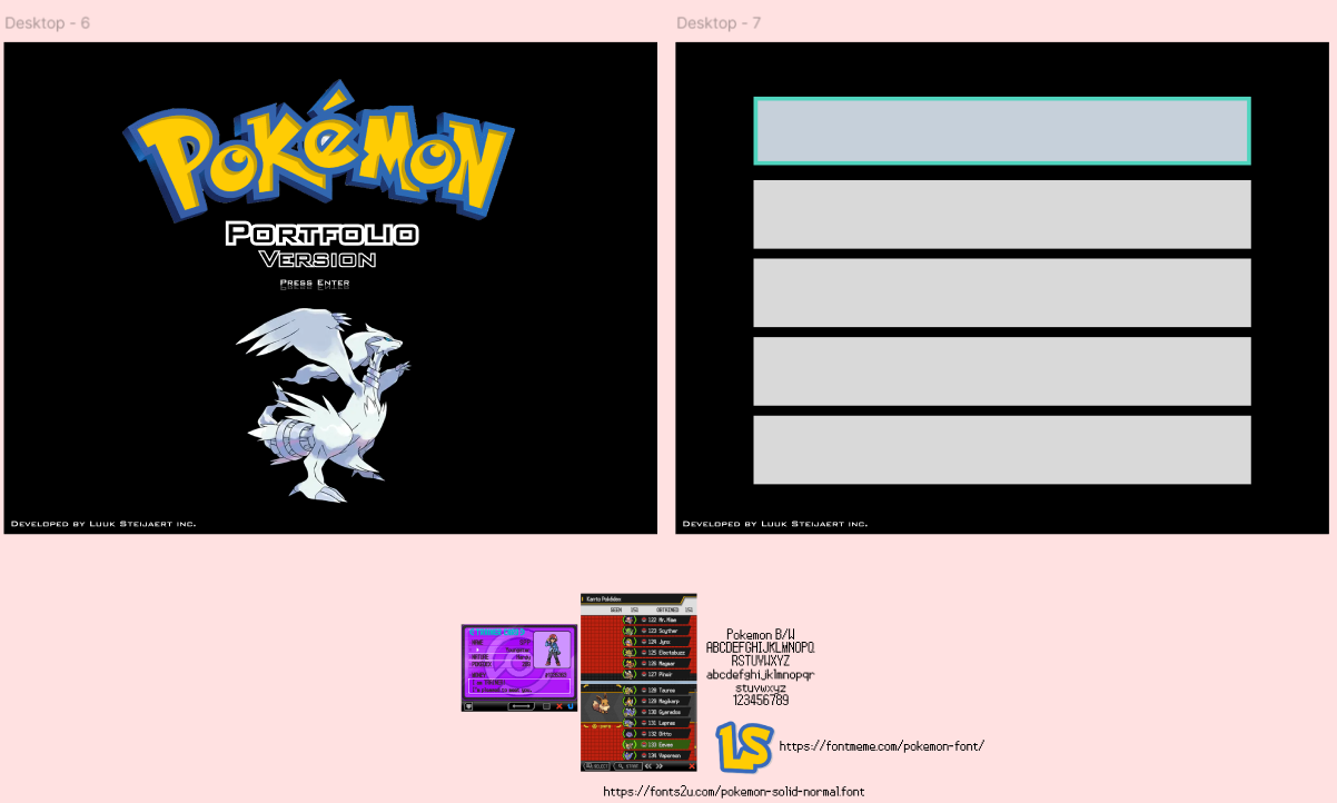
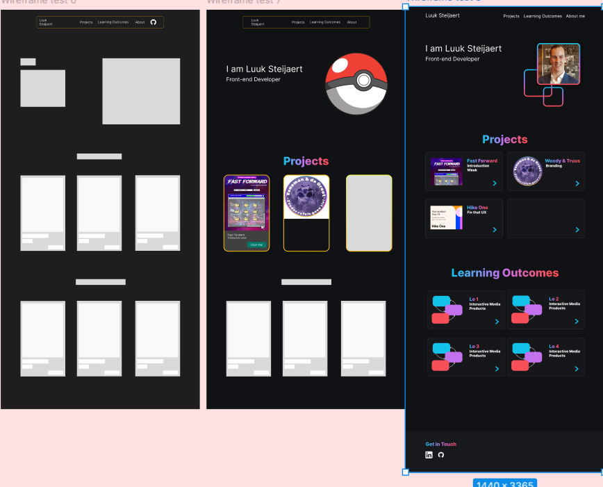
After researching gradients, I wanted my portfolio to reflect my personality. Initially, I was inspired by a Spotify-themed website created by one of my groupmates last year and decided to design my site with a Pokémon theme. However, after receiving feedback, I decided to switch to a more minimalistic structure and ultimately discarded the Pokémon theme entirely.
Wireframe
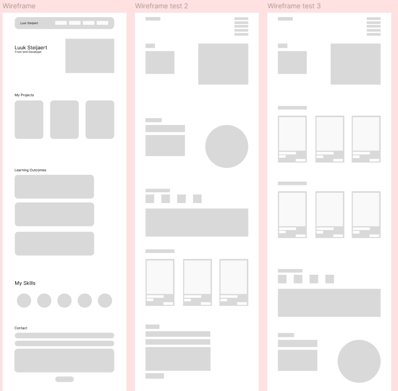
I started off with wireframing my ideas that I had. These three wireframes were the original idea.
Feedback
I asked for feedback on the wireframe and the answer that I got is that I displayed way to much information for what was currently needed for my portfolio.
As Joris said and I quote: "You don't need to add your skills on your website because us as teachers are not interested in that information".
I started to implement what I researched for in my portfolio. Using the darkmode theme and the different cards in the design. I also incorporated gradients to add a modern touch in the texts and the different pages. Below is an example of the final wireframe that i worked on.
Design
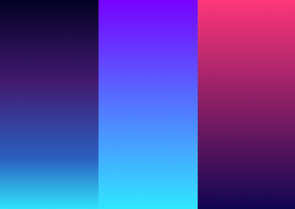
I began exploring different colors from a website that caught my attention and focused on these three colors:
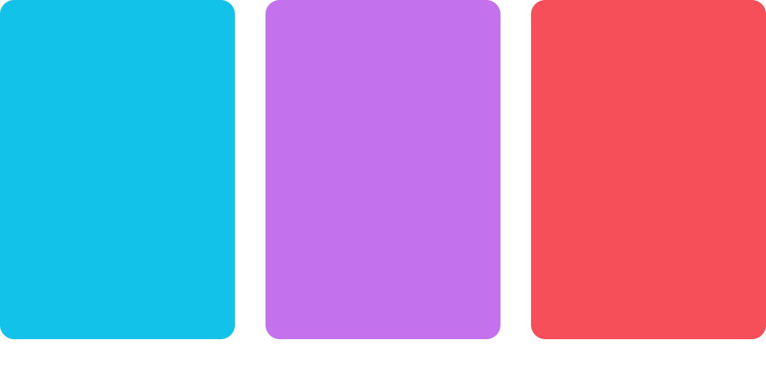
I liked these colors because they work well together as a gradient and also stand out individually on a darker background.
I went for a minimalistic design based of my friend's design, Pepijn L. I asked him if i could use his design as inspiration for my design and he was okay with that.
Feedback
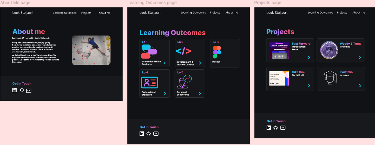
After getting some feedback on my designs I changed up the designs and you can watch them currently on what the website looks like now.
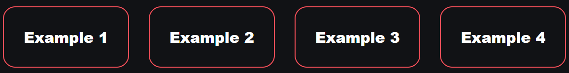
I added example buttons to the learning outcomes for better navigation for the end user. I came to that idea after getting peer feedback from my classmates and looking at their site they also had those example buttons.
Reflection
This project was hard to make because I had to identify myself in a website. Adding different things to the website that made me, me. I liked to work on the project but it was hard for me to pick the right designs because I'm not so good in the designing part but I love the coding bit of it.